Posts Tagged data visualization
Why Rating Systems Sometimes Work
Posted by Bill Storage in Multidisciplinarians on August 22, 2012
Goodfilms is a Melbourne based startup that aims to do a better job of recommending movies to you. Their system uses your social network, e.g., Facebook, to show you what your friends are watching, along with two attributes of films, which you rate on a 10 scale (1 to 5 stars in half-star increments). It doesn’t appear that they include a personalized recommendation system based on collaborative filtering or similar.
In today’s Goodfilms blog post, Why Ratings Systems Don’t Work, the authors point to an XKCD cartoon identifying one of the many problems with collecting ratings from users.

The Goodfilms team says the problem with averaged rating values is that they attempt to distil an entire product down to a scalar value; that is, a number along a scale from 1 to some maximum imaginable goodness. They also suggest that histograms aren’t useful, asking how seeing the distribution of ratings for a film might possibly help you judge whether you’d like it.
Goodfilms demonstrates the point using three futuristic films, Blade Runner, Starship Troopers, and Fifth Element. The Goodfilms data shows bimodal distributions for all three films; the lowest number of ratings for each film is 2, 3, or 4 stars with 1 star and 5 stars having more votes.
Goodfilms goes on to say that their system gives you better guidance. Their film-quality visualization – rather than a star bar-chart and histogram – is a two axis scatter plot of the two attributes you rate for films on their site – quality and rewatchability, how much you’d like to watch that film again.
 An astute engineer or economist might note that Goodfilms assumes quality and rewatchability to be independent variables, but they clearly are not. The relationship between the two attributes is complex and may vary greatly between film watchers. Regardless of the details of how those two variables interact, they are not independent; few viewers would rate something low in quality and high in rewatchability.
But even if these attributes were independent of each other, films have many other attributes that might be more telling – length, realism, character development, skin exposure, originality, clarity of intent, provocation, explosion count, and an endless list of others. Even if you included 100 such variables (and had a magic visualization tool for such data), you might not capture the sentiment of a crowd of viewers about the film, let alone be able to decide whether you would like it based on that data. Now if you had some deep knowledge of how you, as an individual, compare, in aesthetics, values and mental process, to your Facebook friends and to a larger population of viewers – then we’d really know something, but that kind of analysis is still some distance out.
Goodfilms is correct in concluding that rating systems have their perils; but their solution, while perhaps a step in the right direction, is naive. The problem with rating systems is not that they don’t capture enough attributes of the rated product or in their presentation of results. The problem lies in soft things. Rating systems tend to deal more with attributes of products than with attributes of raters of those products. Recommendation systems don’t account for social influence well at all. And there’s the matter of actual preferences versus stated preference; we sometimes lie about what we like, even to ourselves.
Social influence, as I’ve noted in past posts, is profound, yet its sources can be difficult to isolate. In rating systems, knowledge of how peers or a broader population have rated what you’re about to rate strongly influence the outcome of ratings. Experiments by Salganik and others on this (discussed in this post) are truly mind boggling, showing that weak information about group sentiment not only exaggerates preferences but greatly destabilizes the system.
The Goodfilms data shows bimodal distributions for all three films. The 1 star and 5 star vote count is higher than the minimum count of the 2, 3, and 4 star rating counts. Interestingly, this is much less true for Imdb’s data. So what’s the difference? Goodfilms’ rating counts for these movies range from about 900 to 1800. Imdb has hundreds of thousands of votes for these films.
 As described in a previous post (Wisdom and Madness of the Yelp Crowd), many ratings sites for various products have bimodal distributions when rating count is low, but more normally distributed votes as the count increases. It may be that the first people who rate feel the need to exaggerate their preferences to be heard. Any sentiment above middle might gets cast as 5 star, otherwise it’s 1 star. As more votes are cast, one of these extremes becomes dominant and attracts voters. Now just one vote in a crowd, those who rate later aren’t compelled to be extreme, yet are influenced by their knowledge of how others voted. This still results in exaggeration of group preferences (data is left or right skewed) through the psychological pressure to conform, but eliminates the bimodal distribution seen in the early phase of rating for a given product. There is also a tendency at Imdb for a film to be rated higher when it’s new than a year later. Bias originating in suggestion from experts surely plays a role in this too; advertising works.
In the Imdb data, we see a tiny bit bimodality. The number of “1” ratings is only slightly higher that the number of “2” ratings (1-10 scale). Based on Imdb data, all three movies are all better than average – “average” being not 5.5 (halfway between 1 and 10) but either 6.2, the mean Imdb rating, or 6.4, if you prefer the median.
Imdb publishes the breakdown of ratings based on gender and age (Blade Runner, Starship Troopers, Fifth Element). Starship Troopers has considerably more variation between ratings of those under 18 and those over 30 than do the other two films. Blade Runner is liked more by older audiences than younger ones. That those two facts aren’t surprising suggests that we should be able to do better than recommending products based only on what our friends like (unless you will like something because your friends like it) or based on simple collaborative filtering algorithms (you’ll like it because others who like what you like liked it).

Imdb rating count vs. rating for 3 movies
So far, attempts to predict preferences across categories – furniture you’ll like based on your music preferences – have been rather disastrous. But movie rating systems actually do work. Yes, there are a few gray sheep, who lack preference similarity with the rest of users, but compared to many things, movies are very predictable – if you adjust for rating bias. Without knowledge that Imdb ratings are biased toward good and toward new, you high think a film with an average rating of 6 is better than average, but it isn’t, according to the Imdb community. They rate high.
Algorithms can handle that minor obstacle, even when the bias toward high varies between raters. With minor tweaks of textbook filtering algorithms, I’ve gotten movie predictions to be accurate within about half a star of actual. I tested this by using the movielens database and removing one rating from each users’ data and then making predictions for the missing movie for each user, then averaging the difference between predicted and actual values. Movie preferences are very predictable. You’re likely to give a film the same rating whether you saw it yesterday or today. And you’re likely to continue liking things liked by those whose taste was similar to yours in the past.
Restaurants are slightly less predictable, but still pretty good. Yesterday the restaurant was empty and you went for an early dinner. Today, you might get seated next to a loud retirement party and get a bad waiter. Same food, but your experience would color your subjective evaluation of food quality and come out in your rating.
Predicting who you should date or whether you’d like an autumn vacation in Paris is going to require a much different approach. Predicting that you’d like Paris based on movie tastes is ludicrous. There’s no reason to expect that to work other than Silicon Valley’s exuberant AI hype. That sort of prediction capability is probably within reach. But it will require a combination of smart filtering techniques (imputation-boosting, dimensionality reduction, hybrid clustering), taxonomy-driven computation, and a whole lot more context.
 Context? – you ask. How does my GPS position affect my dating preferences? Well that one should be obvious. On the dating survey, you said you love ballet, but you were in a bowling alley four nights last week. You might want to sign up for the mixed league bowling. But what about dining preferences? To really see where this is going you need to expand your definition of context (I’m guessing Robert Scoble and Shel Israel have such an expanded view of context based on the draft TOC for their upcoming Age of Context).
My expanded view of context for food recommendations would include location and whatever physical sensor info I can get, along with “soft” data like your stated preferences, your dining history and other previous activities, food restrictions, and your interactions with your social network. I might conclude that you like pork ribs, based on the fact that you checked-in 30 times this year at a joint that serves little else. But you never go there for lunch with Bob, who seems to be a vegetarian based on his lunch check-ins. Bob isn’t with you today (based on both of your geo data), you haven’t been to Roy’s Ribs in two weeks, and it’s only a mile away. Further, I see that you’re trying to limit carbohydrates, so I’ll suggest you have the salad instead of fries with those ribs. That is, unless I know what you’ve eaten this week and see that you’re well below your expected carb intake, in which case I might recommend the baked potato since you’re also minding your sodium levels. And tomorrow you might want to try the Hủ Tiếu Mì at the Vietnamese place down the road because people who share your preferences and restrictions tend to like Vietnamese pork stew. Jill’s been there twice lately. She’s single, and in the bowling league, and she rates Blade Runner a 10.
Wisdom and Madness of the Yelp Crowd
Posted by Bill Storage in Crowd wisdom, Multidisciplinarians, Probability and Risk on April 20, 2012
 I’ve been digging deep into Yelp and other sites that collect crowd ratings lately; and I’ve discovered wondrous and fascinating things. I’ve been doing this to learn more about when and how crowds are wise. Potential inferences about “why” are alluring too. I looked at two main groups of reviews, those for doctors and medical services, and reviews for restaurants and entertainment.
As doctors, dentists and those in certain other service categories are painfully aware, Yelp ratings do not follow the expected distribution of values. This remains true despite Yelp’s valiant efforts to weed out shills, irate one-offs and spam.
Just how skewed are Yelp ratings when viewed in the aggregate? I took a fairly deep look and concluded that big bias lurks in the big data of Yelp. I’ll get to some hard numbers and take a crack at some analysis. First a bit of background.
Yelp data comes from a very non-random sample of a population. One likely source of this adverse selection is that those who are generally satisfied with service tend not to write reviews. Many who choose to write reviews want their ratings to be important, so they tend to avoid ratings near the mean value. Another source of selection bias stems from Yelp’s huge barrier – in polling terms anyway – to voting. Yelp users have to write a review before they can rate, and most users can’t be bothered. Further, those who vote are Yelp members who have (hopefully) already used the product or service, which means there’s a good chance they read other reviews before writing theirs. This brings up the matter of independence of members.
Plenty of tests – starting with Francis Galton’s famous ox-weighing study in 1906 – have shown that the median value of answers to quantitative questions in a large random crowd is often more accurate than answers by panels of experts. Crowds do very well at judging the number of jellybeans in the jar and reasonably well at guessing the population of Sweden, the latter if you take the median value rather than the mean. But gross misapplications of this knowledge permeate the social web. Fans of James Surowiecki’s “The Wisdom of Crowds” very often forget that independence is essential condition of crowd wisdom. Without that essential component to crowd wisdom, crowds can do things like burning witches and running up stock prices during the dot com craze. Surowiecki acknowledges the importance of this from the start (page 5):
There are two lessons to be drawn from the experiments. In most of them the members of the group were not talking to each other or working on a problem together.
Influence and communication love connections; but crowd wisdom relies on independence of its members, not collaboration between them. Surowiecki also admits, though rather reluctantly, that crowds do best in a subset of what he calls cognition problems – specifically, objective questions with quantitative answers. Surowiecki has great hope for use of crowds in subjective cognition problems along with coordination and cooperation problems. I appreciate his optimism, but don’t find his case for these very convincing.
In Yelp ratings, the question being answered is far from objective, despite the discrete star ratings. Subjective questions (quality of service) cannot be made objective by constraining answers to numerical values. Further, there is no agreement on what quality is really being measured. For doctors, some users rate bedside manner, some the front desk, some the outcome of ailment, and some billing and insurance handling. Combine that with self-selection bias and non-independence of users and the wisdom of the crowd – if present – can have difficulty expressing itself.
Two doctors on my block have mean Yelp ratings of 3.7 and 3.0 stars on a scale of 1 to 5. Their sample standard deviations are 1.7 and 1.9 (mean absolute deviations: 1.2 and 1.8). Since the maximum possible population standard deviation for a doctor on Yelp is 2.0, everything about this doctor data should probably be considered next to useless; it’s mean and even median aren’t reliable. The distributions of ratings isn’t merely skewed; it’s bimodal in these two cases and for half of the doctors in San Francisco. That means the rating survey yields highly conflicting results for doctors. Here are the Yelp scores of doctors in my neighborhood.
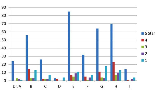
Yelp rating distribution for 9 nearby doctors
I’ve been watching the doctor ratings over the last few years. A year ago, Dr. E’s ratings looked rather like Dr. I’s ratings look today. Unlike restaurants, which experience a rating warm-start on Yelp, the 5-star ratings of doctors grow over time at a higher rate than their low ratings. Doctors, some having been in business for decades, appear to get better as Yelp gets more popular. Three possible explanations come to mind. The first deals with competition. The population of doctors, like any provider in a capitalist system, is not fixed. Those who fare poorly in ratings are likely to get fewer customers and go out of business. The crowd selects doctors for quality, so in a mature system, most doctors, restaurants, and other businesses will have above-average ratings.
The second possible explanation for the change in ratings over time deals with selection, not in the statistics sense (not adverse selection) but in the social-psychology sense (clan or community formation). This would seem more likely to apply to restaurants than to doctors, but the effect on urban doctors may still be large. People tend to select friends or communities of people like themselves – ethnic, cultural, political, or otherwise. Referrals by satisfied customers tend to bring in more customers who are more likely to be satisfied. Businesses end up catering to the preferences of a group, which pre-selects customers more likely to be satisfied and give high ratings.
A third reason for the change over time could be a social-influence effect. People may form expectations based on the dominant mood of reviews they read before their visit. So later reviews might greatly exaggerate any preferences visible in early reviews.
Automotive services don’t fare much better on Yelp than doctors and dentists. But rating distributions for music venues, hotels and restaurants, though skewed toward high ratings, aren’t bimodal like the doctor data. The two reasons given above for positive skew in doctors’ ratings are likely both at work in restaurants and hotels. Yelp ratings for restaurants give clues about those who contribute them.
 I examined about 10,000 of my favorite California restaurants, excluding fast food chains. I was surprised to find that the standard deviation of ratings for each restaurant increased – compared to theoretical maximum values – as average ratings increased. If that’s hard to follow in words, the below scatter plot will drive the point home. It shows average rating vs. standard deviation for each of 10,000 restaurants. Ratings are concentrated at the right side of the plot, and are clustered fairly near the theoretical maximum standard deviation (the gray elliptical arc enclosing the data points) for any given average rating. Color indicate rough total rating counts contributing to each spot on the plot – yellow for restaurants with 5 or less ratings, red for those having 40 or less, and blue for those with more than 40 ratings. (Some points are outside the ellipse because it represents maximum population deviations and the points are sample standard deviations.)
The second scatter shows average rating vs. standard deviation for the Yelp users who rated these restaurants, with the same color scheme. Similarly, it shows that most raters rate high on average, but each voter still tends to rate at the extreme ends possible to yield his average value. For example, many raters whose average rating is 4 stars use far more 3 and 5-star ratings than nature would expect.

Scatter plot of standard deviation vs. average Yelp rating for about 10,000 restaurants

Scatter plot of standard deviation vs. average rating for users who rated 10,000 restaurants
Next I looked at the rating behavior of users who rate restaurants. The first thing that jumps out of Yelp user data is that the vast majority of Yelp restaurant ratings are made by users who have rated only one to five restaurants. A very small number have rated more than twenty.

Rating counts of restaurant raters by activity level
A look at comparative distribution of the three activity levels (1 to 5, 6 to 20, and over 20) as percentages of category total shows that those who rate least are more much more likely to give extreme ratings. This is a considerable amount of bias, throughout 100,000 users making half a million ratings. In a 2009 study of Amazon users, Vassilis Kostakos found similar results in their ratings to what we’re seeing here for bay area restaurants.

Normalized rating counts of restaurant raters by activity level
Can any practical wisdom be applied to this observation of crowd bias? Perhaps a bit. For those choosing doctors based on reviews, we can suggest that doctors with low rating counts, having both very high and very low ratings, will likely look better a year from now. Restaurants with low rating counts (count of ratings, not value) are likely to be more average than their average rating values suggest (no negative connotation to average here). Yelp raters should refrain from hyperbole, especially in their early days of rating. Those putting up rating/review sites should be aware that seemingly small barriers to the process of rating may be important, since the vast majority of raters only rate a few items.
This data doesn’t really give much insight into the contribution of social influence to the crowd bias we see here. That fascinating and important topic is at the intersection of crowdsourcing and social technology. More on that next time.
